A Collector’s guide to the Credor Eichi
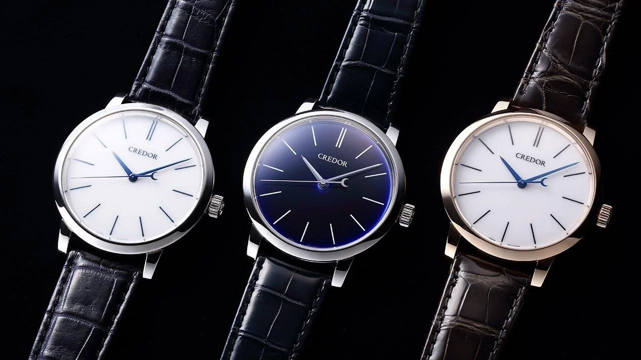
The name Eichi, written 叡智 in Japanese, can be translated as "wisdom." The name is appropriate for a watch that represents the meeting of traditional Japanese craftsmanship and Seiko’s most advanced Spring Drive technology.
The Credor Eichi is a study in restraint. At first glance, there is remarkably little to see: a round precious-metal case, a simple porcelain dial and three slender hands. There are no complications competing for attention. Even the Spring Drive movement powering the Eichi, one of the most technically unusual and innovative forms of mechanical timekeeping developed by Seiko, is hidden behind the dial.
Yet the Eichi may be one of the clearest expressions of Seiko’s highest level of watchmaking.
The story begins in 2008 with the original Eichi, now generally referred to by collectors as Eichi I. Six years later came the Eichi II, larger, cleaner and powered by a newer caliber. Since then, the Eichi concept has evolved through various case - dial combinations, anniversary editions and special Japanese-market creations.
“When you strip away everything that is inessential, it comes down to the quality of the components and precision of their assembly. To achieve this level of purity and simplicity is the most difficult of all”
For collectors, however, the interesting question is not about the rarity or the limited editions of the Eichi, It is the details that reveal the hand of the Micro Artist Studio and makes the Eichi such a special watch.
This is a guide to those details.
The Eichi’s Dial
The Eichi’s dial deserves its own article rightly so but let us touch on it briefly today. The dial is where the Eichi story becomes especially interesting. Calling it a "porcelain dial" is technically correct, but it doesn't adequately describe what makes it special. The porcelain dials on the Eichi, do not just look glossy but they feature some incredible depth, translucence and reflectivity of their own. They vary in appearance all the way from soft to striking based on lighting conditions. These dials can only be understood when seen in person and experienced for some time in various lighting conditions.
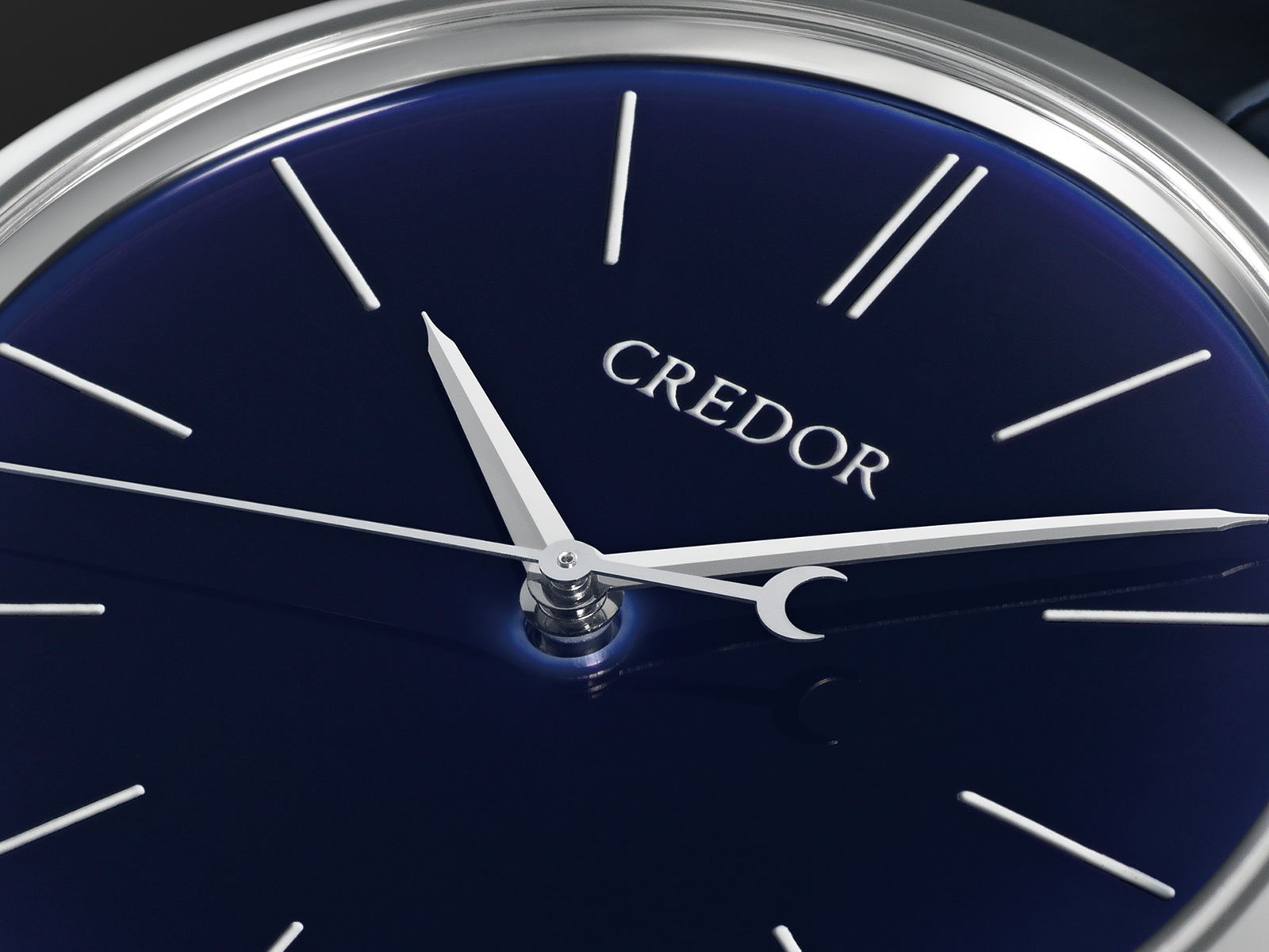
EICHI II Ruri Dial, Seiko
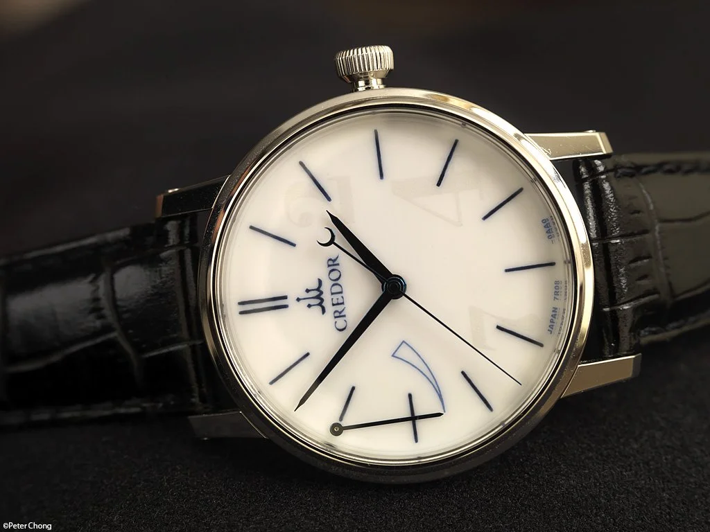
Eichi I Dial, horolograph, Peter Chong
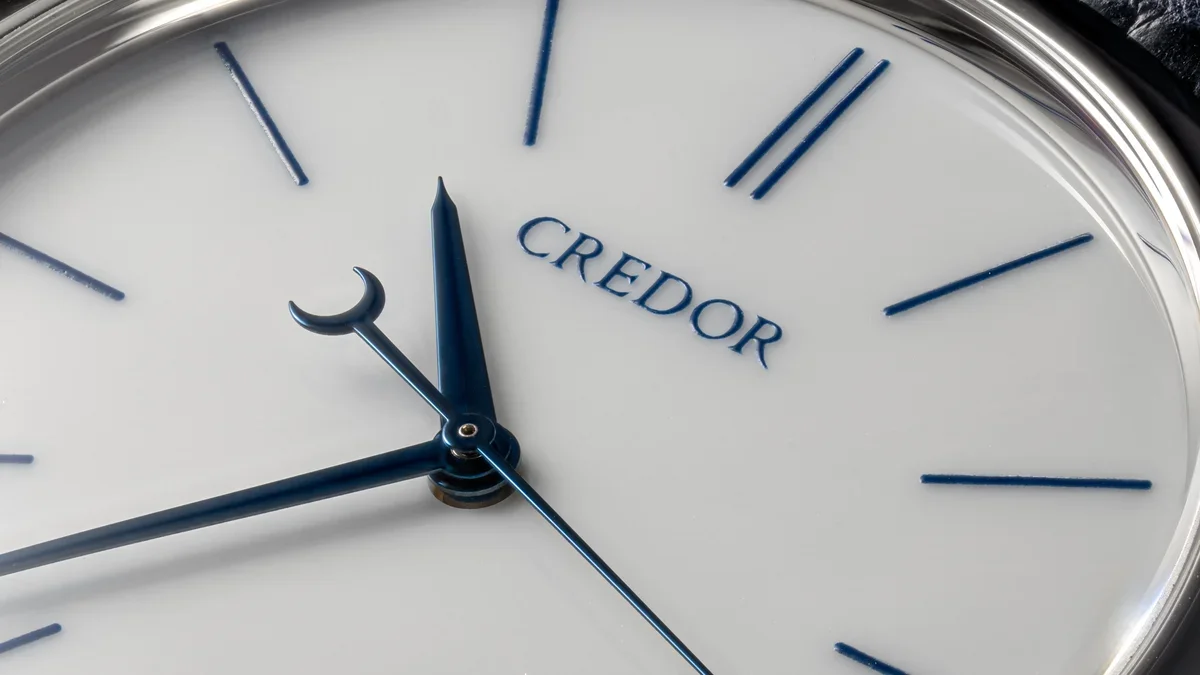
EICHI II GBLT 999 Dial, HAIRSPRING
And then there is the painting, The indices and lettering are not simply printed graphics. They are hand-painted. That distinction is central to understanding the Eichi.
Why Porcelain Is Such a Difficult Watch Dial Material?
There is a tendency in watch writing to describe porcelain as simply "harder than enamel." The reality is more interesting. Enamel and porcelain are different materials with different manufacturing challenges. Enamel involves fusing glass-like material to a substrate through controlled firing. The challenge is controlling the application, firing, color, cracking, bubbling and interaction between the enamel and the underlying dial. A porcelain dial is different because the dial itself is a ceramic object. The manufacturing process has to account for forming the material, firing it at very high temperatures, managing shrinkage and maintaining the required geometry and surface quality.
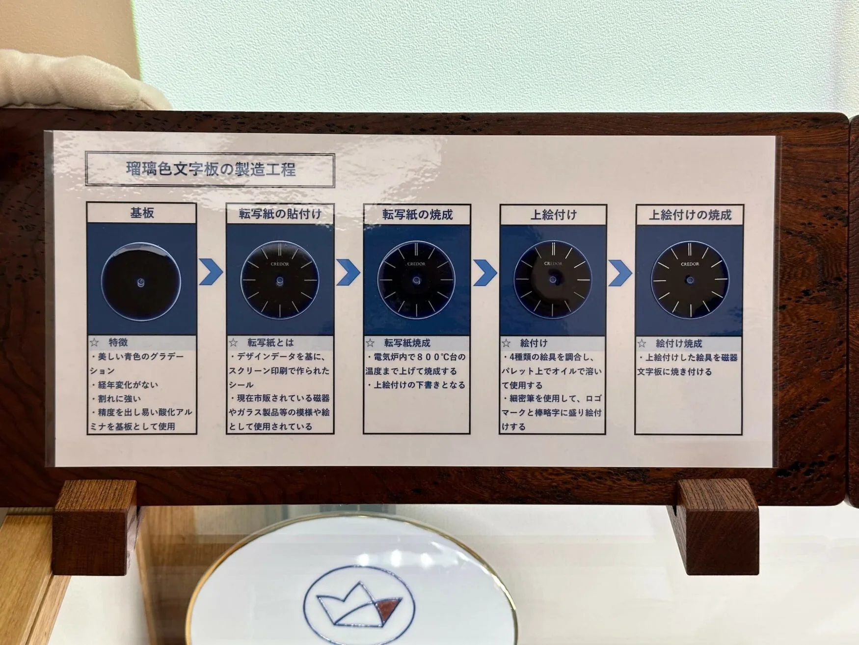
A step by step depiction of the process involved in the Dial making, Porcelain dial fire 1200c → paint → fire again 800c → sand and polish.
Moreover, the firing temperature is around 1,200℃, which is far higher than that of ordinary enamel dials. Other enamel dials would be deformed by such a high temperature, because they use a metal base. But Credor's porcelain dial uses a ceramic base, so that the dial does not become deformed even after firing. After the dial is fired, the indices and logo are hand-painted with specially made brushes, followed again by firing at around 800℃. The surface is then polished, resulting in a refined appearance in which the hands can be seen reflected on the dial.
Ceramic materials change during firing. A dial that looks perfect before firing is not necessarily going to emerge perfect afterward. Shape, surface, color and finish all have to be controlled.
And unlike a movement component that might be hidden beneath another part, a porcelain dial offers almost nowhere for an imperfection to hide.
Manufacturing technicalities aside, Credor spends an incredible amount of time perfecting their glazes and combinations used. On the blue Ruri model for example, Credor explains that more than 20 combinations of glaze and repeated firings were tested before the desired depth of color was achieved. It took them around a couple of years just to get the desired shade of blue on the Ruri dial. Such is the level of attention Credor garners towards these watches.
Painting the Eichi Dial
The apparent simplicity of the Eichi dial makes the painting even more demanding. There are only twelve hour markers and the Credor name, but each element is effectively an individual piece of miniature artwork.
Credor states that each of the twelve indices and the Credor logo are hand-painted by craftsmen at the Micro Artist Studio. The Eichi I dial’s painting was entirely taken care by Noritake porcelain, A Japanese maker of fine bone china that supplies the Japanese Imperial family, which commissioned the entire dial work for the Eichi I but the current production Eichi’s dials are all painted in house.
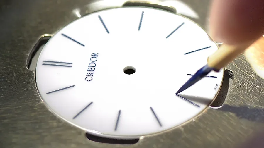
Hand painting, Credor
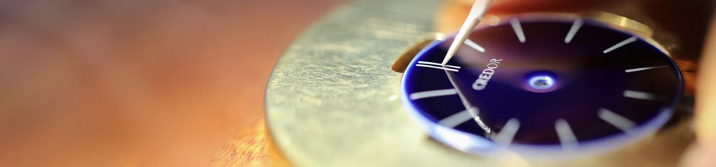
Hand painting, Credor
The process is extraordinarily controlled. First the initial markings are transferred to the dial before the craftsman overpaints them with a very fine brush stroke by stroke. The painted dial is subsequently fired again to about 800C and then sanded and polished. This is one of the most revealing aspects of the Eichi. A machine can produce a perfectly consistent printed index but the Eichi deliberately chooses not to. The objective is consistency without erasing the evidence of human workmanship. Under magnification, the indices are not perfect, they possess minute variations that reveal the fact that a human hand created them.
Eichi References
| Reference | Edition | Case | Dial | Limited | Caliber |
|---|---|---|---|---|---|
| GBLR999 | Eichi I | Platinum 950 | White porcelain | Yes - 25 Pcs | 7R08 |
| GBLT999 | Eichi II | Platinum 950 | White porcelain | No | 7R14 |
| GBLT998 | Eichi II 10th Anniversary | 18K rose gold | White porcelain | No | 7R14 |
| GBLT997 | Eichi II Blue Edition | Platinum 950 | Blue porcelain | No | 7R14 |
| GBLT996 | Eichi II 50th Anniversary | 18K yellow gold | Blue Ruri porcelain with gold decoration | Yes - 30 Pcs | 7R14 |
| GZLT999 | Eichi II WAKO Edition | Platinum | White porcelain | Yes | 7R14 |
Eichi I: Where It Began
The original Credor Eichi was introduced in 2008. It was a deliberately unusual proposition. Seiko had already demonstrated the technical possibilities of Spring Drive, but the Eichi presented the technology in a very different context. Rather than emphasizing complexity, the designers and watchmakers concentrated on purity.
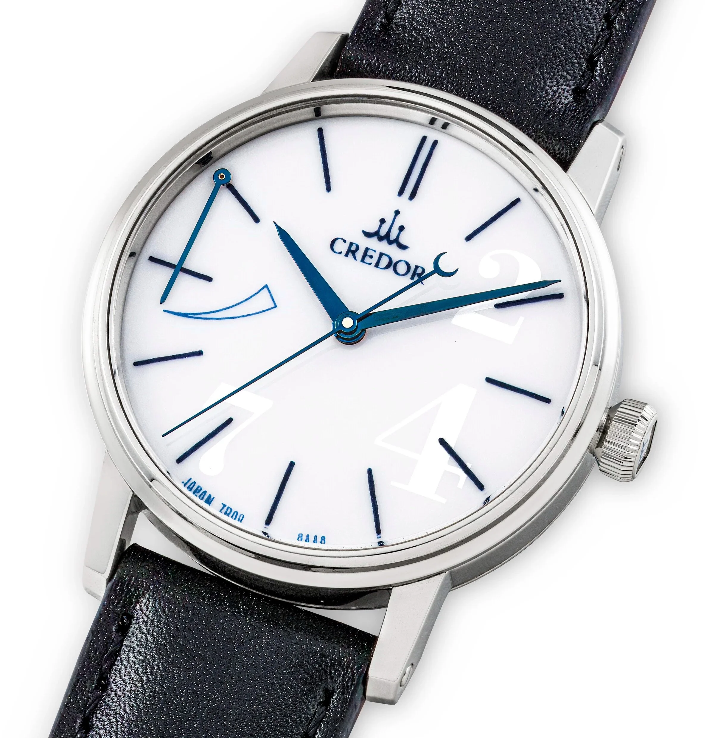
Credor EICHI I, Christies
The result was a 35 mm platinum watch with a porcelain dial and manually wound Spring Drive Calibre 7R08, produced in a limited run of just 25 pieces.
For today's collector, that production number is perhaps the first thing to understand about Eichi I. It is not simply an older version of Eichi II. It is the original expression of the concept and one of the rarest modern watches produced by the Micro Artist Studio.
The Eichi I also reveals some ideas that would later be refined in Eichi II: the emphasis on porcelain, the reduction of the dial to its essential elements, the extensive hand finishing and the use of Spring Drive as an alternative to conventional escapement-based mechanical watchmaking. In several respects, Eichi I is more eccentric than its successor.
The 35 mm case is distinctly smaller by modern standards, the dial incorporates its power-reserve indication, the matte white painted 2, 4, 7 indices visible only in certain angles and the movement architecture and finishing are quite elaborate when compared to the later 7R14. Eichi II would take these ideas and simplify them further.
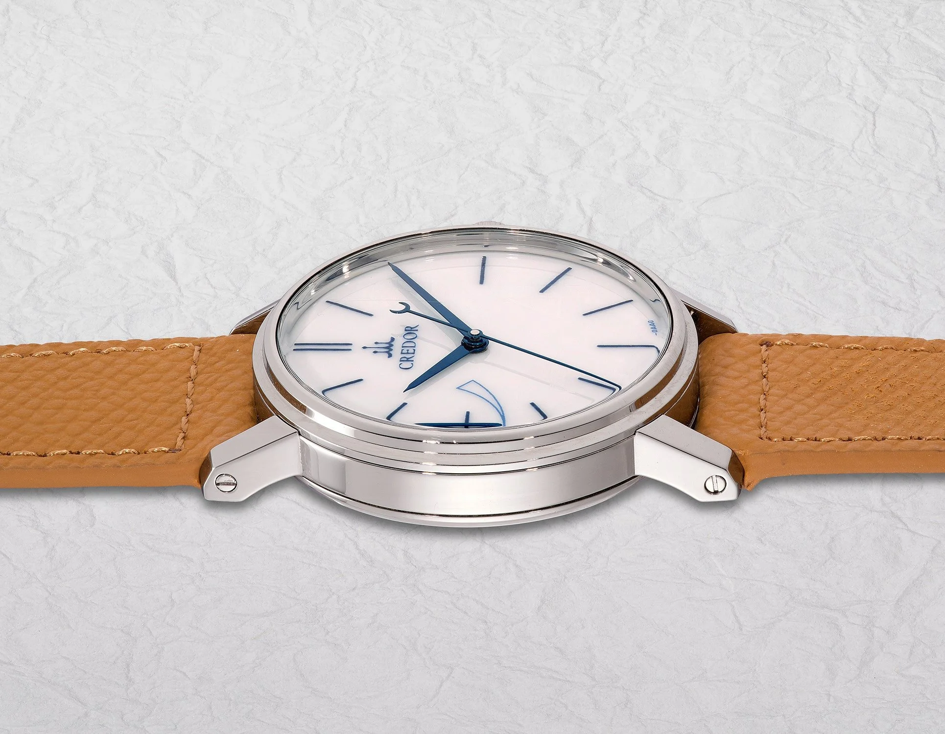
Eichi I side profile, Phillips
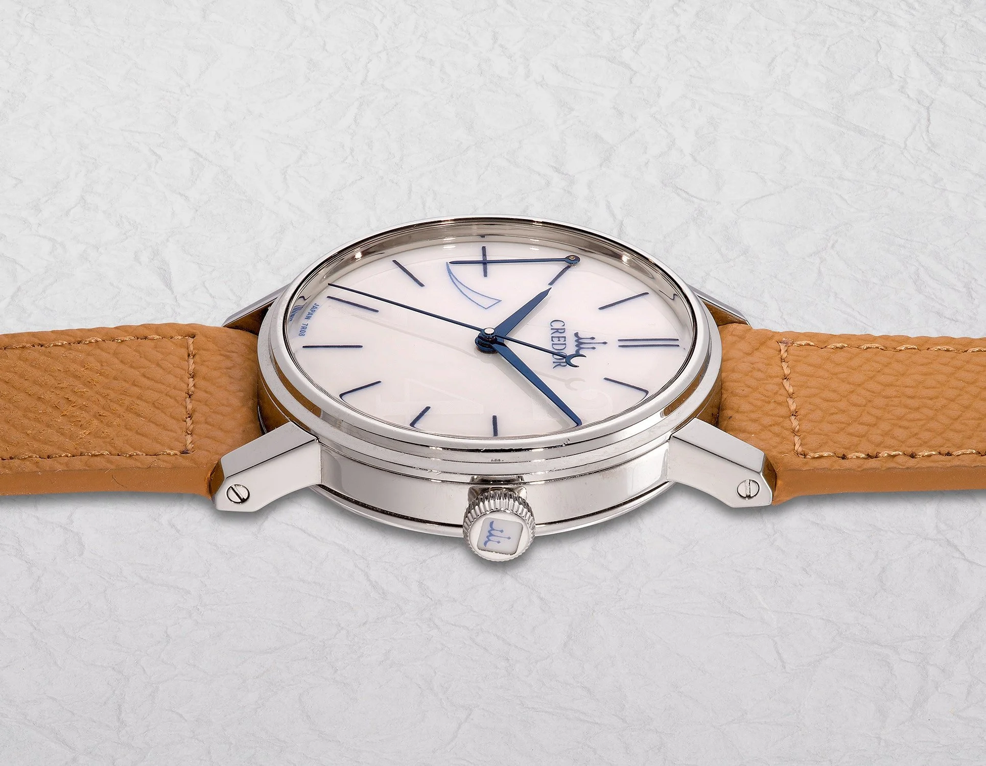
Eichi I crown porcelain insert - also done by Noritake. Phillips
Caliber 7R08: The Heart of Eichi I
Spring Drive: Mechanical Energy, Electronic Regulation
To understand Caliber 7R08, it is first necessary to understand what Spring Drive actually is. It is tempting to describe Spring Drive as a hybrid of a mechanical and quartz movement, but that description can obscure what makes the system so unusual. At its core, Spring Drive is a mechanically powered movement whose rate is controlled electronically.
The source of energy is entirely traditional: a mainspring. There is no battery, conventional electric motor, or escapement. As the mainspring unwinds, its energy is transmitted through the gear train and ultimately drives the hands. But instead of an escapement and balance regulating that energy in discrete impulses, Spring Drive uses what Grand Seiko calls the Tri-Synchro Regulator.
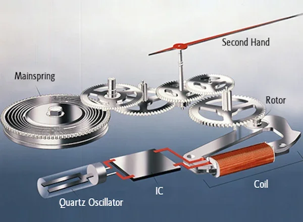
Depiction of Spring drive, Seiko
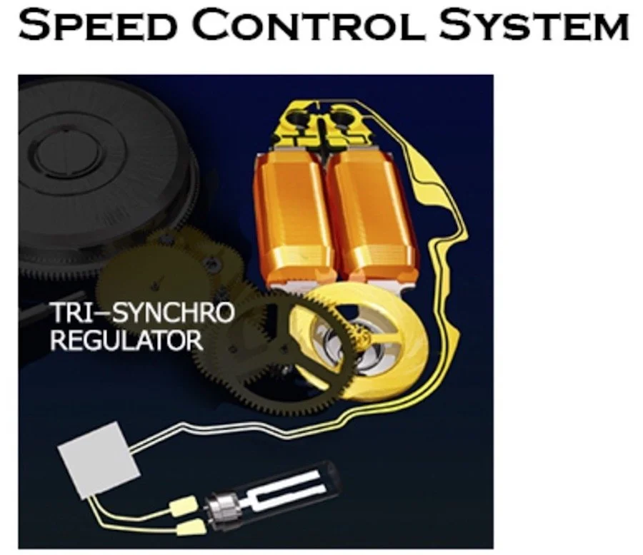
Tri-synchro regulator, Seiko
At the end of the train, the mainspring drives a glide wheel at high speed. That wheel performs three functions simultaneously. Its rotation generates a small amount of electricity through a coil; that electricity powers an integrated circuit, quartz oscillator and the glide wheel is itself regulated by an electromagnetic brake. The IC compares the rotation of the glide wheel against the precise signal of the quartz oscillator and continuously applies or releases the electromagnetic brake to maintain the correct speed.
The result is an unusual division of labor. Mechanical energy provides everything the watch needs to run, while electronic regulation determines how quickly that energy is allowed to leave the mainspring. There is therefore no traditional escapement locking and unlocking the gear train, and no balance wheel oscillating back and forth. Instead, the glide wheel rotates continuously.
This is responsible for Spring Drive's most immediately recognizable characteristic: the seconds hand does not tick. It glides around the dial in a continuous, silent motion. The effect is more than an aesthetic novelty. It is a direct visual consequence of the architecture of the regulator itself.
The original Eichi took this technology and placed it in an entirely different horological context. Rather than presenting Spring Drive as a technical curiosity, Micro Artist Studio treated the 7R08 as the foundation for a traditionally finished haute horology movement. The result was a watch that paired an unconventional regulator with an exceptionally conventional obsession: the quality of the handwork.
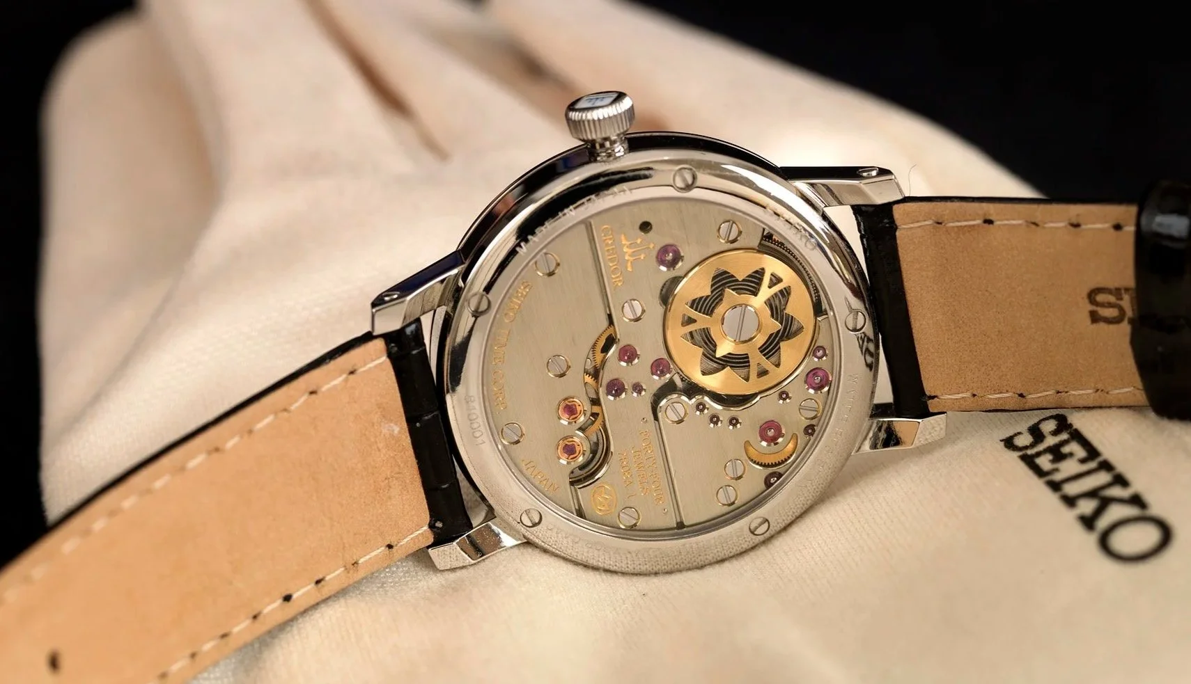
Eichi I Caliber 7R08, Horolograph, Peter Chong
The Torque Return System
One of the most interesting technical features associated with the Eichi movement is the Torque Return System. A mainspring produces more torque when fully wound than is required to maintain the desired running characteristics of the movement. Rather than simply allowing that excess energy to go unused, the Torque Return System redirects some of it back into the mainspring.
Credor explains that approximately 30% of the available torque is unnecessary when the mainspring is fully wound. In Calibre 7R8, the system operates for approximately 35 hours after full winding and helps bring the power reserve to approximately 60 hours.
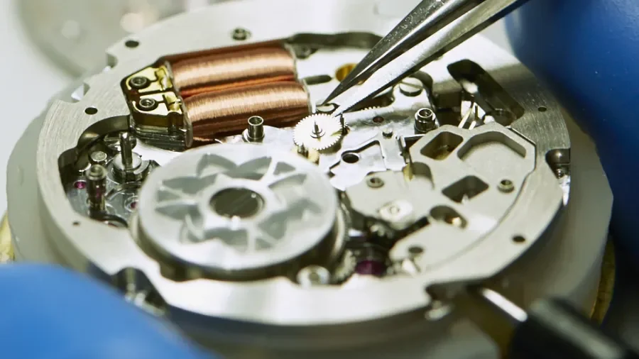
Spring Drive, Torque return System, Credor
The important point for collectors is that the system is not simply a marketing feature attached to the name "Spring Drive." It is an elegant mechanical solution to an energy-management problem. It is a first for Seiko as well.
Movement Finishing: The Japanese Approach
The finishing of Caliber 7R08 is easiest to appreciate when viewed not as decoration, but as a study in controlling light. Almost every visible surface has a different job. The broad surfaces remain restrained and linear, while the edges are shaped into highly reflective bevels. Between them are polished recesses, jewel sinks, screw heads and the finely finished components of the gear train. The movement therefore changes character continuously as it moves under the light.
One of the defining features of the original 7R08 is its use of unplated German silver, or maillechort, for the movement plates and bridges. German silver develops its own appearance through finishing. Its warm, slightly yellow-greytone gives the movement a softer visual quality than rhodium-plated steel or brass.
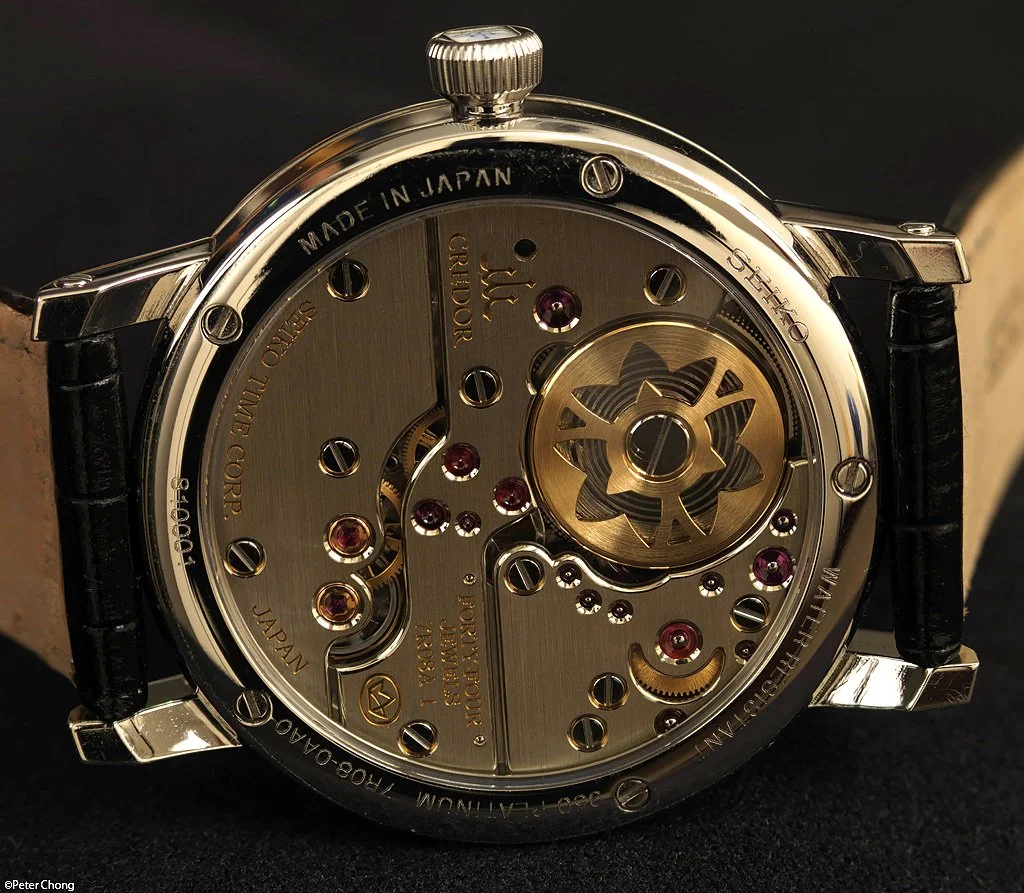
Caliber 7R08, Horolograph, Peter Chong
The Broad Surfaces
The large upper surfaces of the bridges are not decorated with conventional Geneva striping. Instead, they carry an exceptionally fine linear texture.
This is important because the restrained brushing gives the movement its visual structure. Rather than breaking the bridges into a series of decorative waves, the lines run in a controlled direction across their surfaces. Under direct light, the texture becomes visible, when the light moves away, the surface becomes comparatively quiet.
Achieving this effect consistently is not simply a matter of dragging an abrasive across the metal. The surface must remain exceptionally flat, and the direction and density of the strokes need to be controlled. A slight variation in pressure or movement can change how the surface reflects light.
The result is deliberately understated. The broad bridges establish a calm background against which the polished edges become much more prominent.
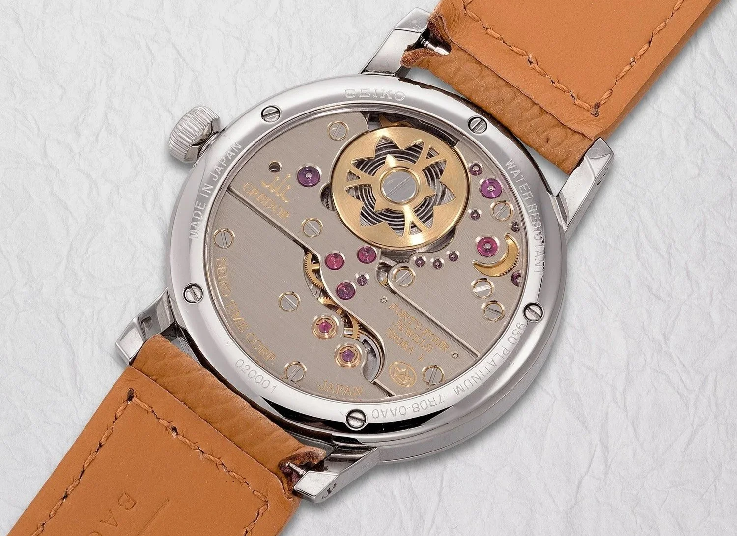
Cal 7R08, Phillips
The Bevels
The real spectacle begins at the edges of the bridges. The bridges are cut with substantial bevels, and these bevels are not merely functional chamfers intended to remove a sharp edge. They become independent surfaces that are shaped and polished by hand.
On the 7R08, the bevels have a flowing character. Rather than maintaining a simple, mechanically uniform strip around the bridge, their width and curvature respond to the architecture of the part. This is particularly apparent where a bevel approaches another feature, such as a jewel opening or an internal corner.
The most revealing areas are often the smallest ones.
A straight external edge is comparatively straightforward, the artisan can establish the bevel and carry it along the length of the bridge. An internal angle is much more difficult because two surfaces converge and there is far less room for the polishing tool.
The original Eichi is notable for its treatment of these internal and external angles. The bevels do not simply stop where the geometry becomes complicated. They continue into the corners, with the transition carefully shaped so that the polished surface remains visually coherent.
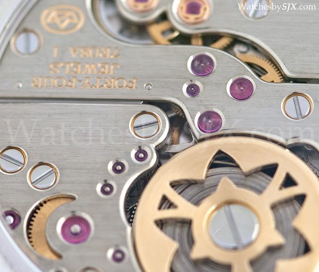
7R08 Finishing, Tons of internal and external angles, beautiful and thick anglage, SJX watches.
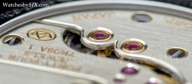
Internal angle that can make a Collector Weep, SJX watches
This is one of the areas where the 7R08 reveals the amount of handwork involved. A machined movement can look extraordinarily clean from a distance, but under magnification the difference becomes apparent. Machine finishing tends to produce predictable geometry, while hand finishing can carry a surface continuously through changing shapes.
Jewel Countersinks
The areas surrounding the jewels deserve equal attention. The ruby bearings are set into countersunk openings in the bridges, and these openings are themselves finished. The transition between the flat bridge, the countersink and the jewel creates a small circular surface capable of catching light very strongly.
The challenge is maintaining the circular geometry while producing a clean, reflective surface around it. The edge cannot be allowed to become irregular, and the polishing must not introduce visible distortion into the surrounding metal.
Micro Artist Studio specifically identifies the areas around the ruby bearings as demanding polishing work. The objective is not merely to make them shiny, but to ensure that light follows the curved surface cleanly.
This is one reason the Eichi can appear almost jewel-like when photographed close up. The effect is not coming from the rubies alone. It comes from the polished metal surrounding them.
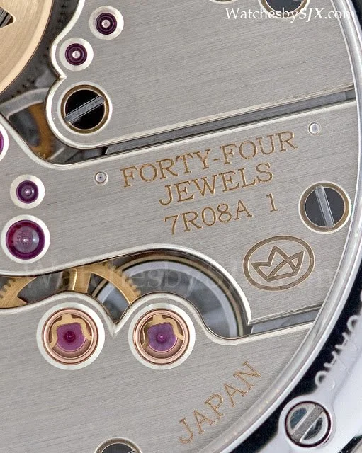
Deeply polished Jewel Counter sinks, SJX Watches
The Gear Train
The finishing philosophy extends beyond the bridges.
The wheels of the 7R08's gear train receive considerably more attention than would be necessary simply for functional operation. Their surfaces carry fine concentric finishing, while the ends of the wheel arbors are rounded and polished.
The rounded pivot ends are a particularly nice example of finishing serving both function and appearance. A pivot does not need to be mirror-polished merely to make the movement run. But once the movement is being finished to this level, every visible component becomes part of the overall composition.
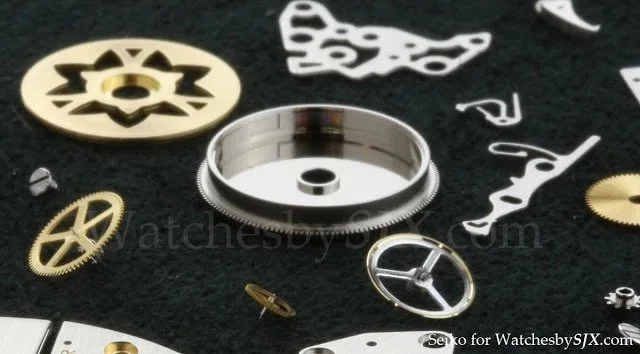
the polished Barrel, Finishing to an extreme Degree, SJX Watches
The polished ends also interact with the jewels. Viewed through the ruby bearings, small flashes of light appear beneath the bridges, creating depth rather than leaving the gear train as a collection of flat, industrial-looking components.
The Barrel and Bellflower
The mainspring barrel provides perhaps the most distinctly Japanese detail on the movement.
Rather than leaving the barrel bridge as a purely functional component, MicroArtist Studio incorporated an open worked bellflower motif, representing the kikyo associated with the Shiojiri region. The motif is cut directly into the structure and then finished along its edges.
This is important because it shows that the decoration of the 7R08 was not simply an attempt to reproduce Swiss movement finishing. The finishing vocabulary - beveling, polishing, countersinking and fine surface treatment - is rooted in traditional high-end watchmaking, but the visual language of the movement remains specific to the Eichi.
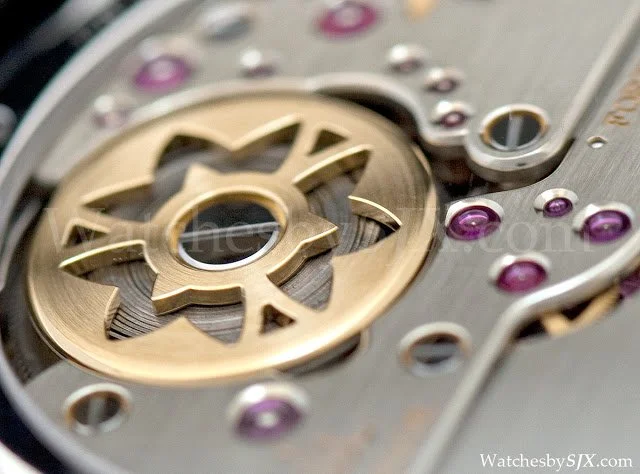
Bell Flower on 7R08, SJX watches
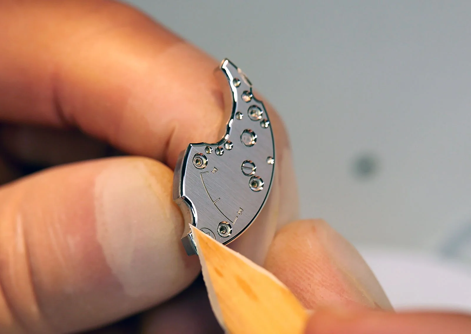
Polishing with a Gentian wood, a technique borrowed from the great Dufor himself, Credor
There is also an interesting Philippe Dufour connection. During the early development of the Micro Artist Studio, its watchmakers travelled to Switzerland to study Dufour's approach to high-end movement finishing. They returned with pieces of gentian wood traditionally used by Dufour to polish the bevels of his bridges. The wood was used for the final polishing of the Anglage on the Eichi's German-silver bridges. Eventually, the Studio found a suitable source of gentian in northern Japan, allowing the process to be carried out entirely in Japan.
The influence of Dufour is therefore most apparent in the finishing philosophy rather than the design itself: extremely clean geometry, substantial hand-finished bevels and a refusal to treat the finer details as unimportant.
Eichi II: Refining the Idea
In 2014, Credor introduced the Eichi II. The timing was significant. It marked both the 40th anniversary of Credor and the 15th anniversary of Spring Drive. If Eichi I was the original statement, Eichi II was the refinement. The case grew from 35 mm to 39 mm, making the watch considerably more contemporary without becoming large. The movement changed from Calibre 7R08 to Calibre 7R14, and perhaps most importantly, the dial was stripped back even further. The power-reserve indication disappeared from the dial, It moved to the back of the movement. This is an apparently small change but one that perfectly captures the philosophy of Eichi II. The wearer still has access to the information without interfering with the purity of the dial. The matte white 2, 4, 7 arabic indices and the porcelain insert in the crown that were present on the EICHI I are no longer present here. Credor describes the watch as an expression of "ultimate simplicity," with the design eliminating extraneous elements as far as possible. That is perhaps the best way to understand the difference between the two generations.
Calibre 7R14
With the Eichi II came Caliber 7R14, a new generation of Spring Drive movement that retained the fundamental architecture of the 7R08 but substantially changed its expression. The most obvious difference is the movement layout. The original 7R08 used three bridges arranged in a series of horizontal lines, while the 7R14 adopts two larger bridges that flow across the movement in a much more unified form.
The change was not simply cosmetic. The Eichi II was conceived as a more restrained interpretation of the original, and the movement was redesigned to match that philosophy. The power-reserve indicator was moved from the dial to the movement side, allowing the front of the watch to be reduced to its essential elements. The 7R14 therefore became both simpler visually and more integrated in its architecture.
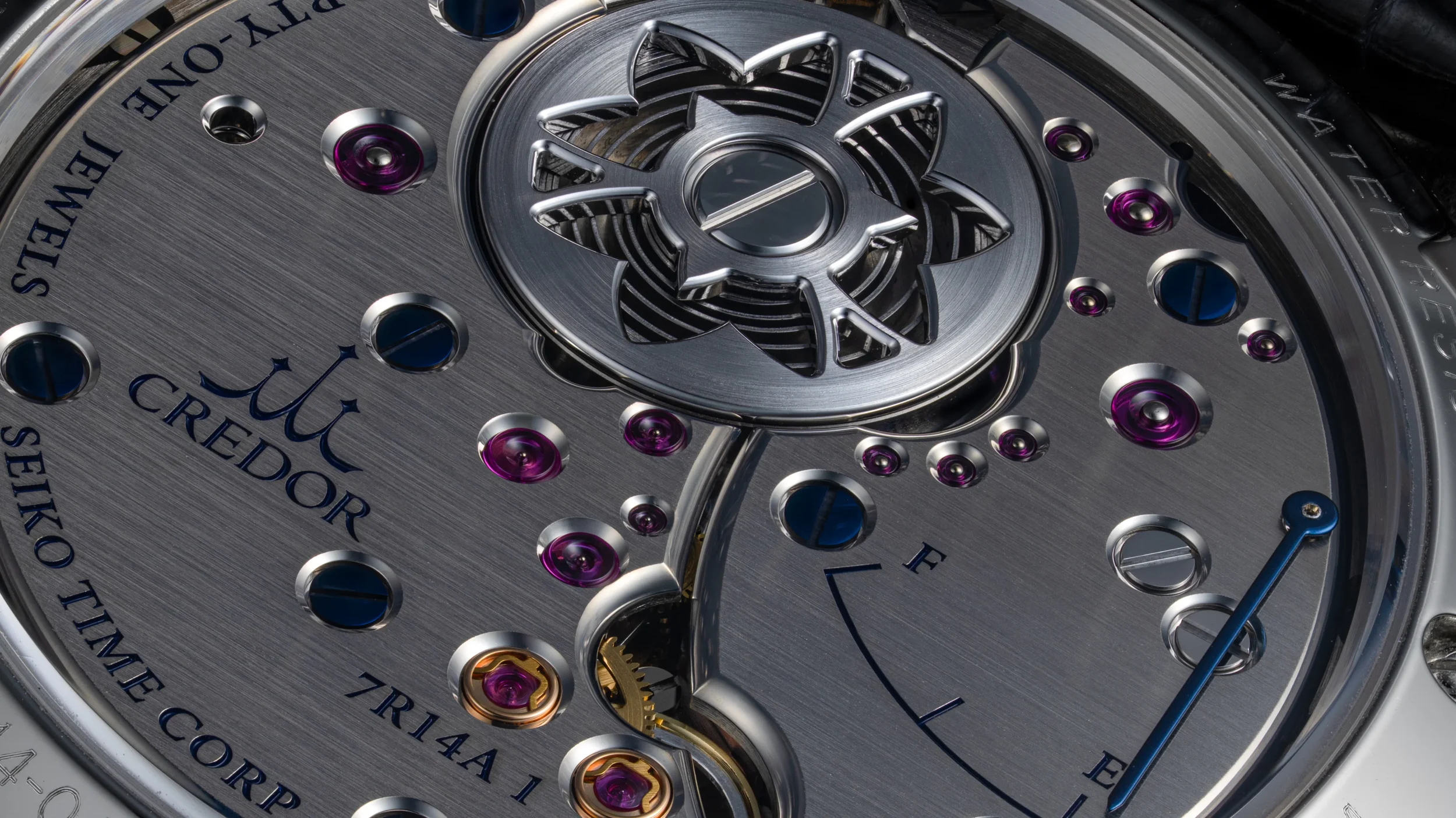
Caliber 7R14, HAIRSPRING
There is also a significant change in material. While the original 7R08 used untreated German silver, the 7R14 uses rhodium-plated brass. The result is immediately visible: where the 7R08 has the warmer, slightly muted character of German silver, the 7R14 has a brighter and harder-looking appearance.
The finishing itself does not need to be revisited in detail here, as we discussed it in the Caliber 7R08 section. Fundamentally, all the same techniques are used, but the difference in visual language is worth noting. Thick and broad anglage, stunningly polished jewel countersinks, immaculately brushed bridges, a polished gear train, and blued screws and hands make for a sight to behold. The dark bridges, blued screws and hands, gold chatons, and red rubies create a particularly vibrant scene on the back of the Eichi II.
The broader bevels and cleaner two-bridge architecture give the movement a more open appearance. The bellflower motif remains, but it becomes more integrated into the movement rather than appearing simply as a decorative element. The open-worked barrel represents the flower itself, while the flowing forms of the bridges evoke its stem and petals. The bellflower is the floral symbol associated with Shiojiri, tying the movement directly to the place where the Micro Artist Studio operates.
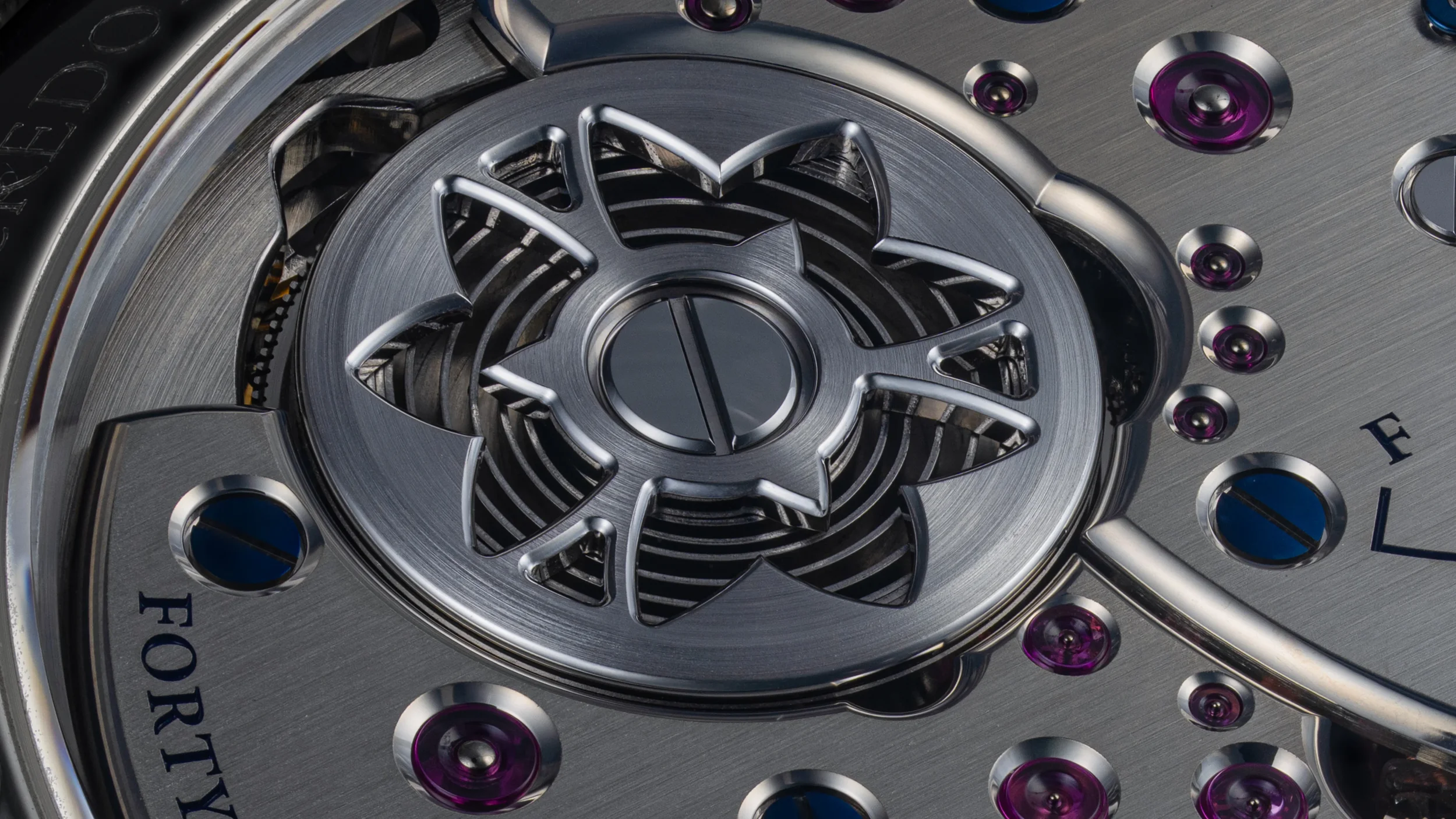
Bell flower on the EICHI II, HAIRSPRING
Technically, 7R14 also retains the Torque Return System introduced with the original Eichi's 7R08. It continues to extract useful energy from excess torque at high mainspring wind and contributes to the approximately 60-hour power reserve. The fundamental Spring Drive concept therefore remains intact; what changed was the movement's architecture, presentation and refinement.
In that sense, the 7R14 was not introduced because the 7R08 had become obsolete. The original 7R08 had already established what Micro Artist Studio could do with Spring Drive. The 7R14 allowed the studio to take that foundation and build a movement more closely aligned with the philosophy of Eichi II: fewer visual elements, broader and more flowing forms, and an even clearer emphasis on the relationship between architecture and hand finishing.
The progression from 7R08 to 7R14 is therefore best understood as an evolution rather than a technological reset.
Eichi II and the Porcelain Dial
With the Eichi II, the dial was pared back even further. The power-reserve indicator disappeared from the dial entirely, moving to the back of the 7R14, leaving only the hour, minute and seconds hands, twelve hand-painted markers and the Credor name.

The original EICHI II Dial, ACM
The porcelain itself also became a defining part of the Eichi II's identity. The dial is exceptionally vibrant and glossy yet soft with a gentle curvature created through the firing and glazing process. Each marker and the Credor signature is painted individually by hand, giving what initially appears to be an almost perfectly uniform dial a subtle human character when examined closely.
While the Eichi I dial was entirely commissioned by Noritake, the Eichi II dial is entirely made in house. The Dial Blank is provided by a specialized supplier but firing, glazing and painting is all done in house at the micro artist studio.
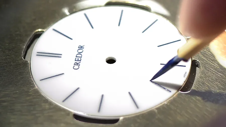
Hand painting in action at the micro artist studio, Credor
The difference between the two dials is therefore not dramatic in terms of basic design, but significant in philosophy. Eichi I retains a few discreet elements that invite the eye to explore the dial; Eichi II removes almost everything that is not essential to telling the time. The result is a dial that feels less like a conventional watch dial and more like a deliberately blank porcelain surface from which the hands and markers emerge.
This became the foundation for the subsequent Eichi II references. The underlying dial concept remained remarkably consistent, while later editions explored it through different porcelain colors, case materials and variations in the hand-painted markings.
The Eichi II References
GBLT999 - The Original Eichi II
The GBLT999 is the reference that established the Eichi II as we know it today. Introduced in 2014 to mark Credor’s 40th anniversary and the 15th anniversary of Spring Drive, it pairs a 950 platinum case with the now-familiar white porcelain dial and hand-painted blue markers.
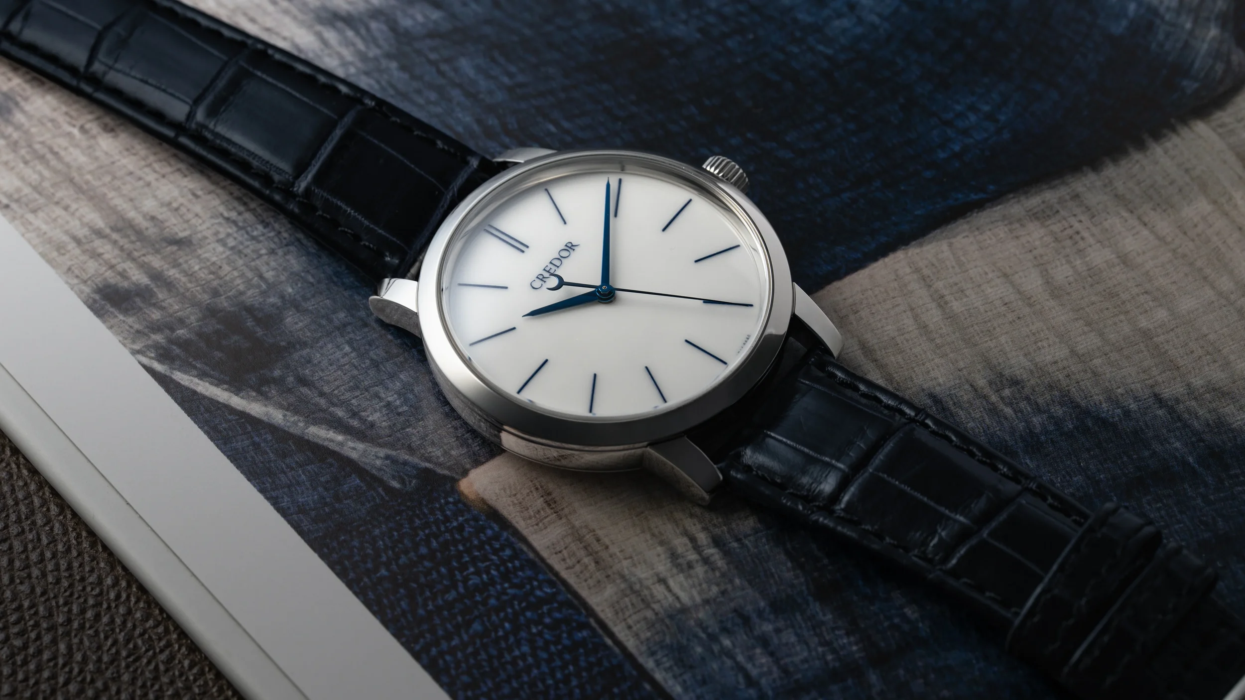
GBLT 999, HAIRSPRING
Compared with the original Eichi, the Eichi II is larger at 39mm and considerably cleaner in execution, most notably by moving the power-reserve indication from the dial to the movement. The result is an exceptionally restrained front, with nothing competing with the porcelain surface, blue hands and slender seconds hand. The GBLT999 therefore represents the essential Eichi II formula: platinum, white porcelain, hand-finished 7R14 Spring Drive and an almost austere approach to decoration.
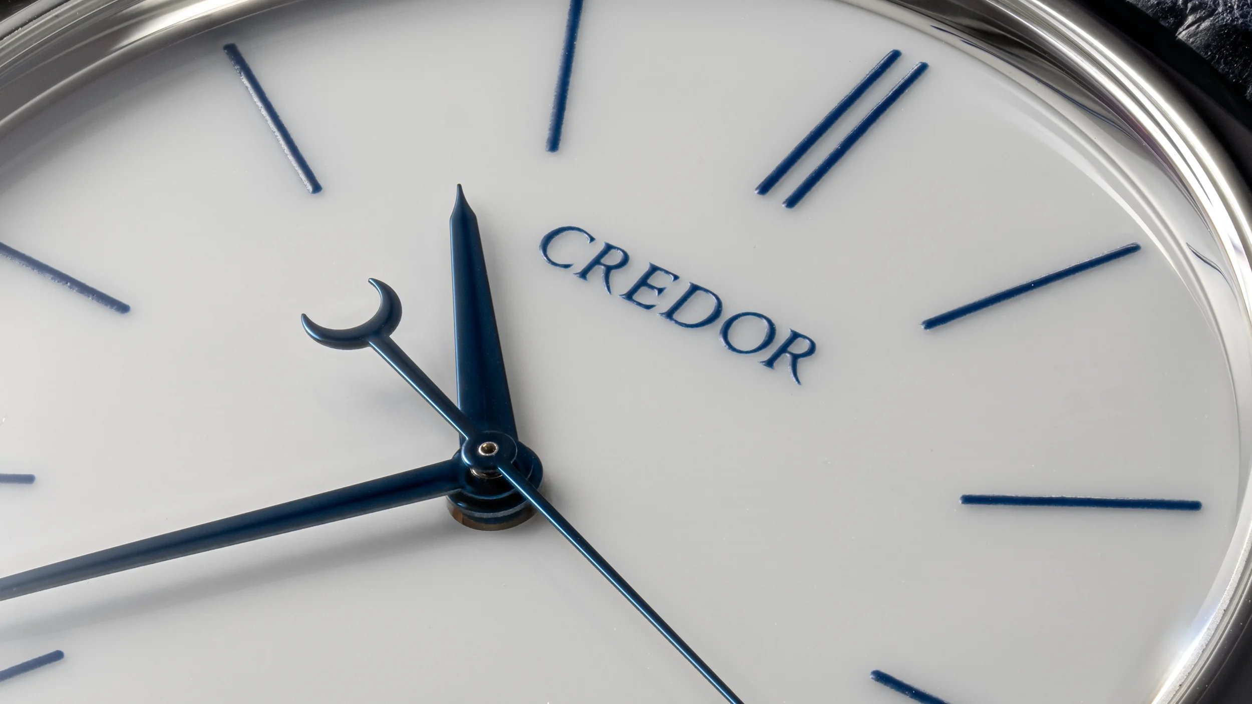
GBLT999 Dial up close, showing the handpainted Credor Text, indices, stunning blued hands and milky while porcelain hue, HAIRSPRING
GBLT998 — Eichi II 10th Anniversary
The GBLT998 takes the Eichi II architecture into 18K rose gold. The change in metal has a surprisingly significant effect. The white porcelain dial remains cool and almost austere, while the rose-gold case introduces warmth. This makes the watch feel less monochromatic than the platinum version without changing the fundamental design. For collectors, GBLT998 is therefore interesting not simply because it is a different precious metal, but because it demonstrates how sensitive the Eichi design is to its surrounding materials. The dial remains the dominant element and the case is deliberately subordinate.
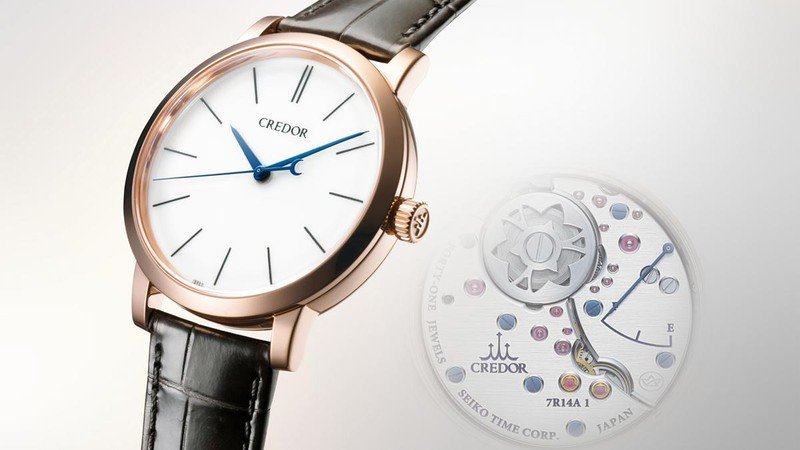
Credor GBLT 998, Rose Gold, Credor
Credor also introduced cold forging for the case, followed by specialized Zaratsu polishing and hand finishing around the lugs, emphasizing that even the apparently simple case received the same attention to detail as the dial and movement. Although it was introduced for the 10th anniversary, it is not a limited edition and it is still in production today.
GBLT997 — Eichi II Ruri
The GBLT997 is the Eichi II that most dramatically changes the formula. It retains the Platinum 950 case and Calibre 7R14 but replaces the white porcelain with the deep blue Ruri dial. It features the same 39 mm case dimensions, 41-jewel movement and approximately 60-hour power reserve as the standard Eichi II.
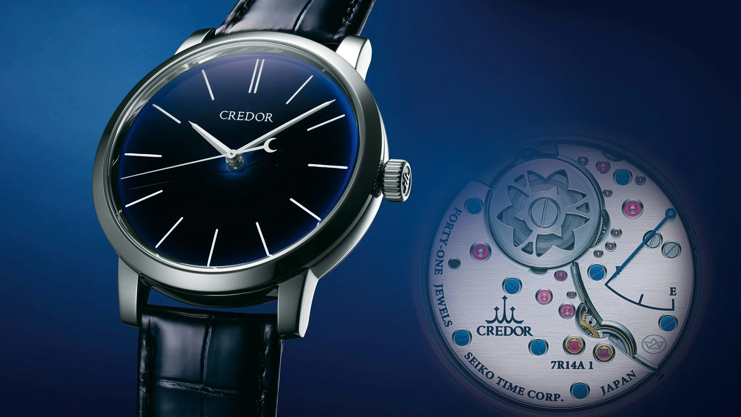
RURI Dial
The Ruri dial of the Credor Eichi II is one of those watch dials that is difficult to understand from photographs alone. At first glance, it appears to be simply a very dark blue porcelain dial. In person, however, the surface has a remarkable combination of depth, translucency, curvature and changing color. The blue can appear almost black in subdued light, then open up into a much brighter, richer blue as the light moves across it.
What makes it particularly interesting is that this isn't achieved by simply painting a blue color onto a flat metal dial. It is a porcelain dial with a high-temperature glaze, developed specifically for Credor's Ruri color and repeatedly fired.
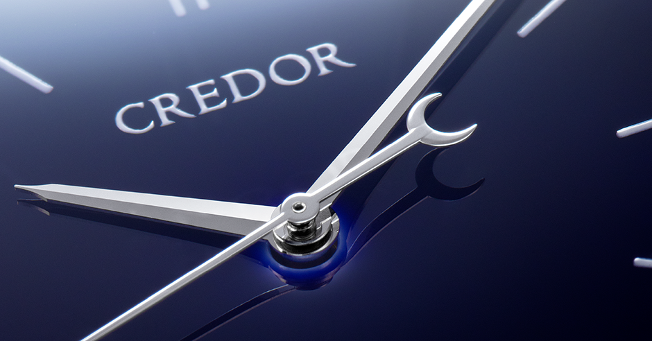
The Ruri Up close, showing the curvature, different gradient of blue across, Credor
“Ruri” (瑠璃) is the Japanese name associated with lapis lazuli, and Credor deliberately uses the term to describe the deep blue of the Eichi II dial because the color recalls the depth and lustre of lapis lazuli.
“It took more than two years just to develop the blue” - Credor
This is probably the most remarkable part of the story. Credor didn't simply select an existing blue glaze and put it onto the Eichi II. The particular Ruri blue had to be developed. The Micro Artist Studio team tried more than 20 different combinations of glaze blends and repeated firings before achieving the required sense of depth and the shade of blue.
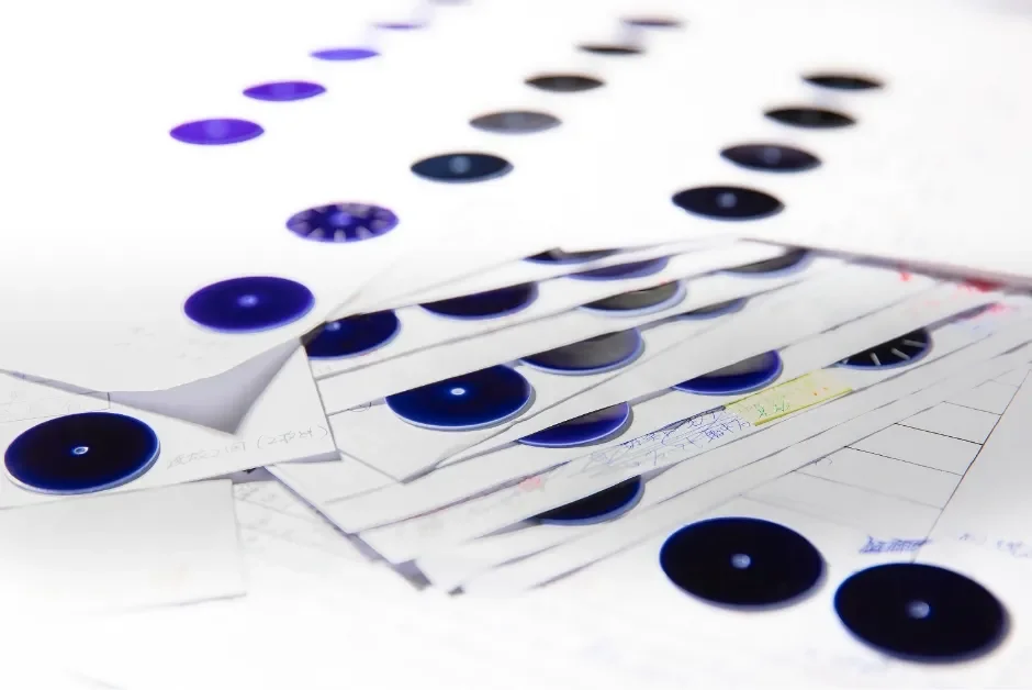
Different shades of Blue RURI in works, Credor
Another detail that makes the Ruri Eichi II particularly fascinating is that the dial has a gentle natural curvature. Credor explains that the glaze creates surface tension as it is fired, producing a slightly domed shape. This is crucial to the 3D-like appearance.
“The very nature of porcelain leads to the glaze being slightly thinner at the edge and centre of the dial so that, as light plays across each dial, it reveals its own particular shades and tones.” - Credor
Credor specifically points out that the glaze isn't visually identical in thickness across the dial. This is why you can sometimes see the dial transition from an almost inky, blackish navy in one area to a more saturated or luminous blue elsewhere. It's not necessarily a deliberately painted blue gradient in the conventional sense. Instead, the physical characteristics of the glaze and porcelain interact with light. Think of the difference between looking at a thick piece of blue glass and a very thin piece of the same glass. Even though the material is nominally the same color, the amount and direction of light passing through and reflecting from it can make the color appear substantially different. The result is that the outer portions can acquire a subtly different tone from the centre, and the transition can move depending on where the light source is.

Ruri appearing bright blue, ACM
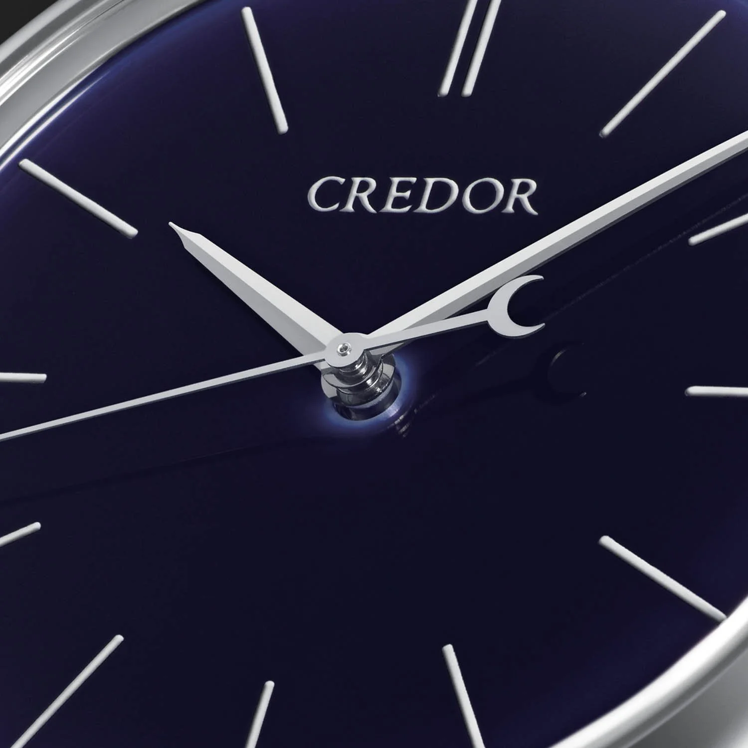
Ruri appearing dark navy, Monochrome Watches
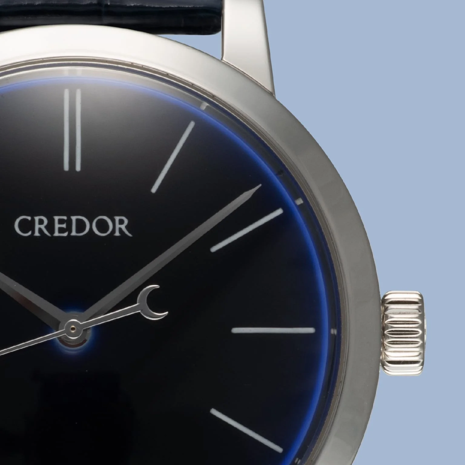
Ruri appearing almost black, Credor
The dial is very playful, Under low, soft illumination, the Ruri blue can become extraordinarily dark. It can approach navy or even appear almost black. Under stronger illumination, the blue becomes more apparent. Change the angle between the watch and the light source and different parts of the glaze catch the light differently. The curved surface means that different areas are effectively presented to the light at different angles. This a watch that needs to be experienced in person to understand it fully.
GBLT996 — Eichi II 50th Anniversary
The GBLT996 was created to commemorate Credor's 50th anniversary and was limited to just 30 pieces. The case is 18K yellow gold, but the real distinction is the special Ruri-colored porcelain dial and its traditional Japanese decorative treatment. After the hand-painted elements are fired, gold is applied over the painted areas, producing a warm contrast against the blue porcelain.
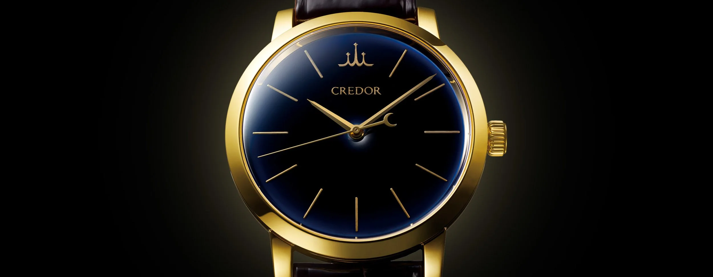
Credor GBLT 996
Credor connects this technique with Ruri-Kinsai, a traditional Japanese craft in which gold decoration is applied over a ruri-colored material. This is a particularly good example of the Eichi philosophy because it isn't simply a commemorative watch with "50th Anniversary" printed somewhere on the dial, It becomes an opportunity to explore another traditional Japanese decorative technique.
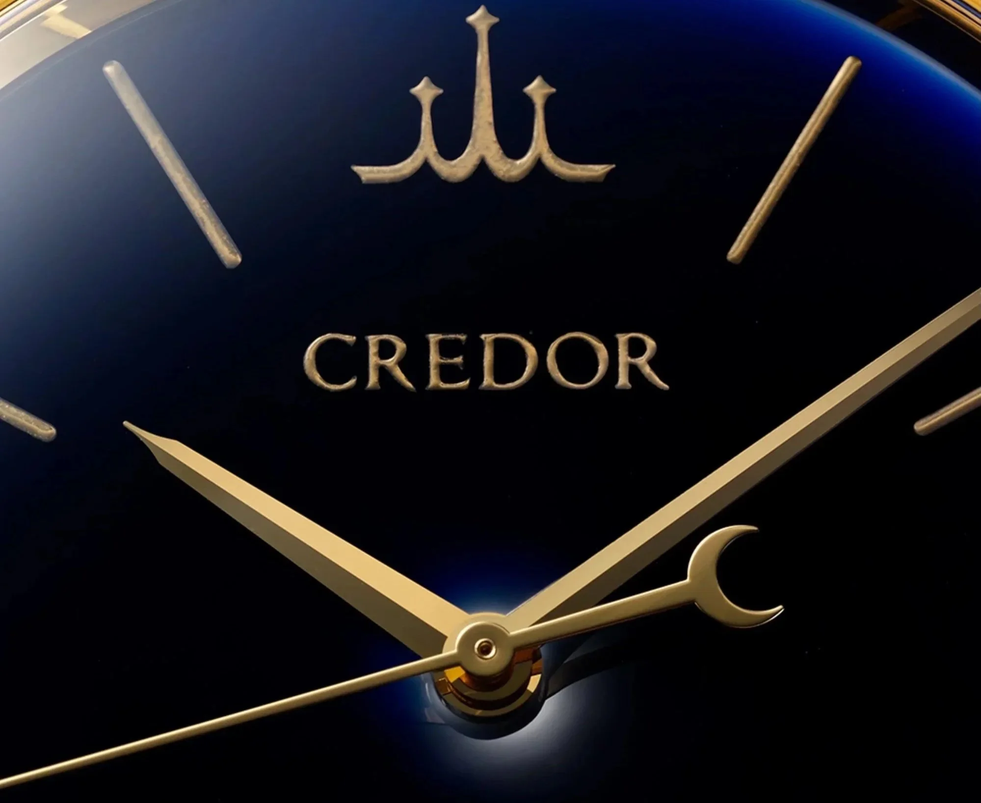
Ruri Dial with gold paint, Notice the Credor logo hand painted instead of two Batons at 12 O clock, A cool touch.
The result is considerably more elaborate and striking than the standard Eichi II, while still retaining the basic architecture of the watch.
GZLT999 — Eichi II WAKO Edition
The GZLT999 occupies a different place in the Eichi family because of its connection to WAKO in Tokyo's Ginza district. WAKO has long occupied a distinctive position within Japanese luxury retail, and a WAKO-specific Eichi consequently has significance beyond its technical specification. For collectors, this is precisely the kind of reference that can become disproportionately interesting over time. The watch itself remains unmistakably Eichi II but its provenance connects it to a particular institution and to Japanese domestic collecting culture.
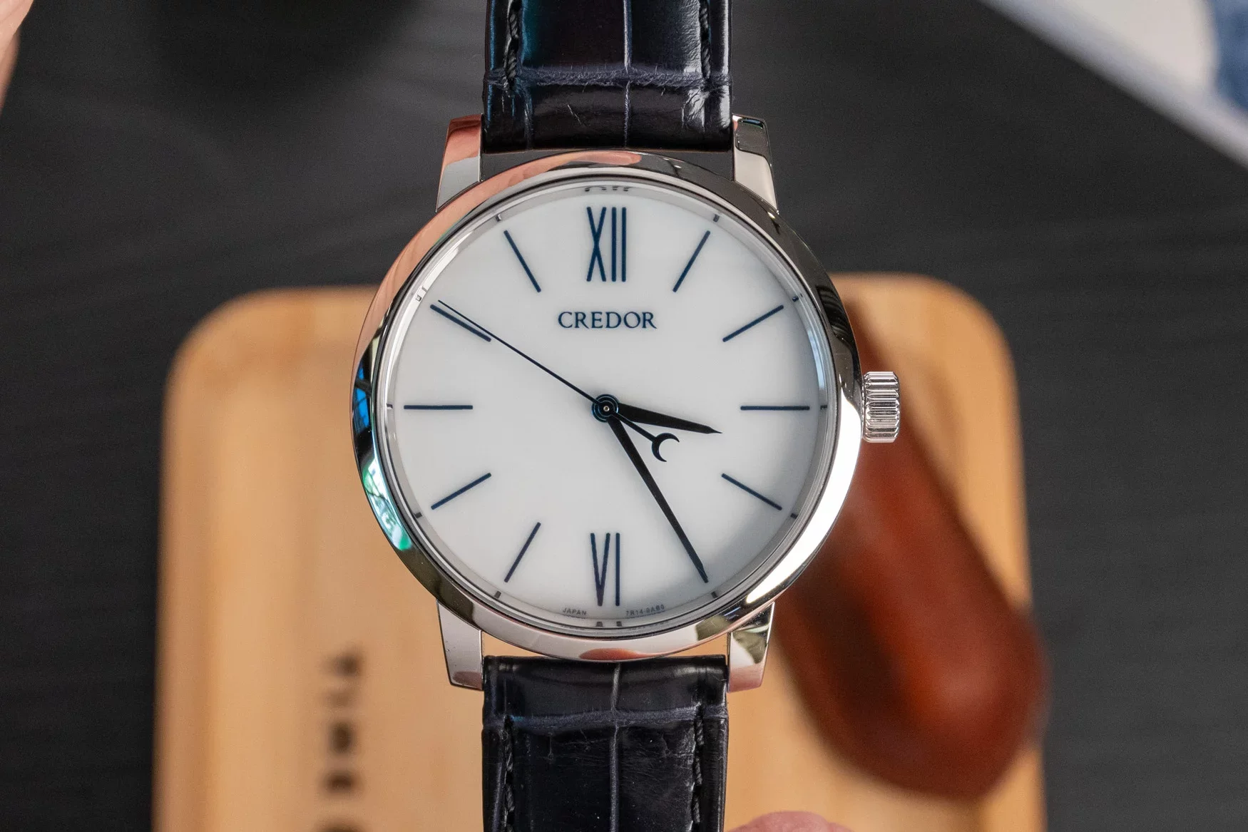
GZLT 999 WAKO edition, Zach Blass’s personal collection - TimeTide Watches.
The WAKO edition Eichi II features the same white porcelain dial as the regular GBLT999 but the indices at 12 and 6 are not executed in baton style as usual instead, they’re Roman numerals. Here is why that’s really cool. A standard Eichi II requires 13 lines to be painted(1 line at 11 indices and 2 lines at the 12 o clock index). The Wako Edition ups the ante with a total of 17 lines, and therefore requiring more time to execute.
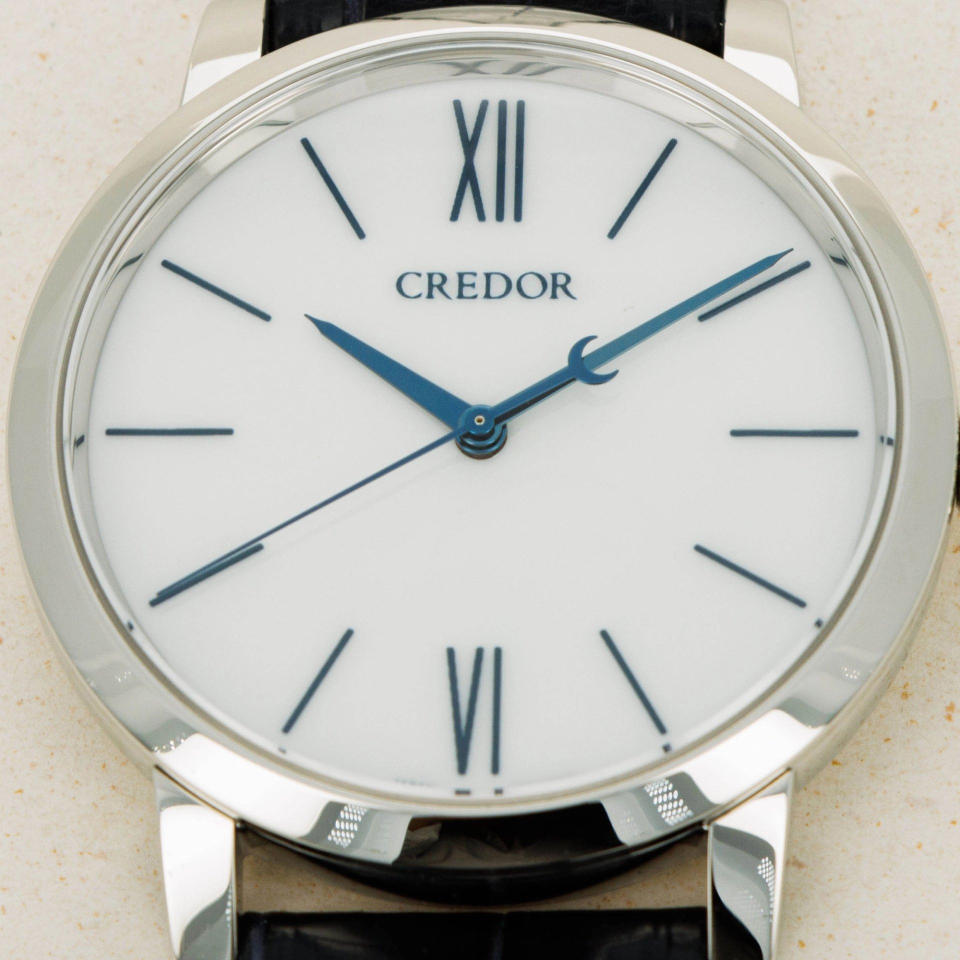
Dial Close up, LoupeThis
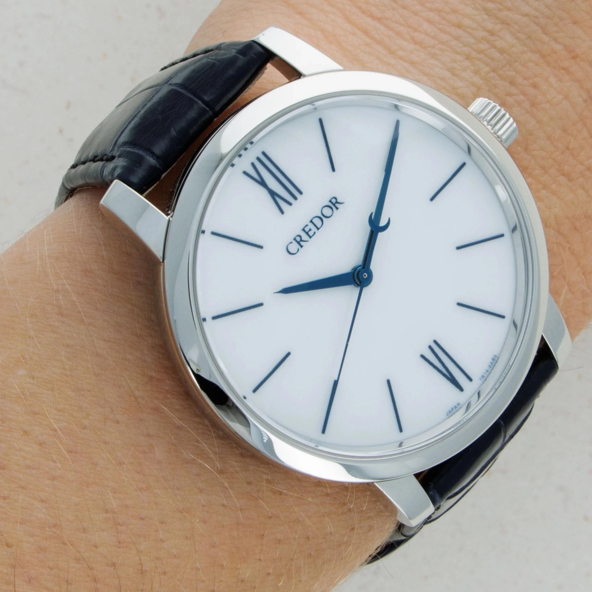
On the wrist, LoupeThis
The Credor Eichi II GZLT999 Wako Edition came in a small limited edition run of an undisclosed number. It was exclusively sold at Wako building, now known as Seiko House Ginza.
The Eichi Market
The Eichi occupies an unusual position in the secondary market. It is quite obscure with relatively low transaction volume as it is estimated that Credor only produces roughly about 25 Eichi IIs each year and the Eichi I has a lifetime run of only 25 pcs.
The Eichi I is extremely desirable and market values are hovering around high 100s (USD) range at the time of publishing the article(Sep 2026), In the past Eichi I reached almost 225k USD at the Phillips Toki Auction in 2024 and a touch under 200k at the Christies Auction in 2025
Among the standard production Eichi IIs, the Ruri (GBLT997) seems to be the most desirable with values touching mid - high 60s and occasionally low 70s (USD), Followed by the platinum white dial (GBLT 999) in the mid 40s - 50s(USD), and the Rose Gold (GBLT998) in the low 40s(USD) at the time of publishing the article.
There are not sufficient comps of the LE edition - WAKO(GZLT999) or the 50TH Anniversary (GBLT996). However there was one WAKO(GZLT999) that sold for about 34k usd on LoupeThis in 2023 that’s worth noting.
Closing thoughts
No Hype, Less Marketing, Pure substance - This is what comes to mind when you think of an Eichi. No speculation, No Financial motive - It is the one for true watch lovers.
The most remarkable thing about the Eichi may be what it refuses to do. It doesn't attempt to impress with mechanical complexity. It doesn't put a Tourbillon on the dial. It doesn't add a complicated calendar. It doesn't rely on diamonds/gems or extravagant decoration. Instead, it takes three of the most basic components of a watch - case, dial and movement — and pushes each of them to an extreme.
The case is finished to a level expected of the finest, The dial turns porcelain into a precision component and then uses hand painting to elevate its beauty to the highest degree, The movement takes Spring Drive, a uniquely Japanese approach to timekeeping, and gives it the kind of hand finishing normally associated with the finest traditional mechanical movements. The watch therefore becomes an argument for restraint. It suggests that simplicity is not the absence of craftsmanship. It may actually require more of it. It is a watch that rewards looking closely and is notoriously difficult to understand from photographs alone.
At a distance, the watch appears almost austere. At arm's length, it is simply beautiful. Under a loupe, however, it is a different beast completely. It is a watch that needs to be experienced and owned for a substantial time to understand it fully.
Get in touch!
This article is based entirely on research and observations found on the internet and from our friends. It is a continuous work in progress and will be updated as we find more information. We would also love to hear your thoughts, suggestions, or if you would like to contribute!
Instagram
Whatsapp
Email
Sources and further research
CREDOR - Creativity of Artisans
CREDOR - Masterpiece Collection
Hodinkee - The Seiko Credor Eichi II
Time and Tide Watches - GZLT999 Wako Edition is possibly the rarest Credor Eichi II
SJX Watches - Hands-On With The Seiko Credor Spring Drive Eichi
SJX Watches - Face Off: Seiko Credor Eichi I vs Eichi II
Horolograph - The H-List: #2 Seiko Credor Eichi (GBLR999)
LoupeThis - CREDOR EICHI II GZLT999 PLATINUM
Phillips Toki Auction - EICHI I
Christie's - Eichi I auction
Huge Thanks to @hairspring, @sjxwatches @zachblass @acm for the photographs and @sjxwatches, @jxsu for information on the EICHI I which is very scarce in itself.